10 Tips for Effective Email Unsubscribe Pages


While many companies are afraid to let customers leave, unsubscribe links are a must-have for every email marketing campaign. Take a look at it from another angle — in fact, you just clean your contact base and send newsletter emails only to those who are interested in them. You can also enable users to manage email frequency — it’s an effective key to subscriber retention.
Our tips will help you build the best unsubscribe links and pages. Prior to diving into those steps, we need to find out why customers would want to leave us and why we need to add those scary unsubscribe links to our emails.
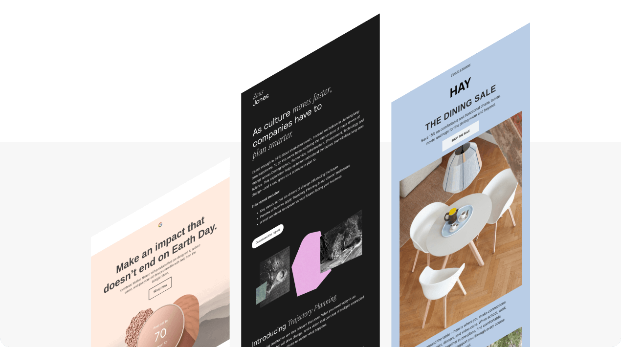
Common reasons why people unsubscribe from your emails:
-
high email frequency;
-
irrelevant information;
-
your messages are not optimized for mobile devices;
-
hard selling;
-
your content is not personalized;
-
customers' preferences have changed.
The killer reasons to start adding the “Unsubscribe” links to your newsletters:
-
it is required by the GDPR rules, the CanSPAM act, and the Australian spam laws. The fines range from $16 000 per address to €20 million;
-
when subscribers aren’t annoyed by your newsletters, you are less likely to get reported for sending spam;
-
you will not waste your money on sending emails to those who are no longer interested in your company;
-
you give customers the freedom of choice.
Ok, now that we are well aware of the necessity of adding unsubscribe links to our emails, we need to find out where exactly to add them.
Traditionally, they are located in the email footer.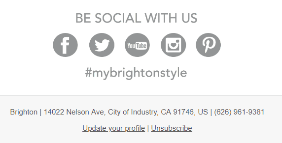
(Source: Email from Brighton)
All unsubscribe email examples are pretty alike.
The unsubscribe link best practices
-
It should be noticeable — you need to be sure that recipients will not miss it.
-
Only single opt-out is allowed in the EU— provide customers with the ability to unsubscribe from your promo emails with just one click — comply with the GDPR rules. Double opt-out is allowed across the US, Canada, Eastern Europe, and Asia.
-
The unsubscribe link should lead recipients directly to the unsubscribe confirmation page, where you kindly inform them that they have been successfully removed from your contact base.
-
Always add the "Update preferences" link to the footer of your emails. Recipients who were previously interested in your brand and now have the ability to set their new interests at any time, are more likely to do so rather than unsubscribe from you.
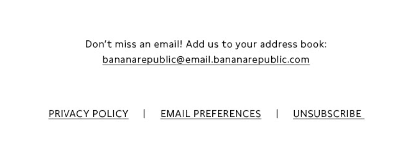
(Source: Email from Banana Republic)
Important to note:
Remember to clean your contact base prior to sending out a new promo campaign. So take out unsubscribes and update the data with your latest segmentation. One way to further clean is to verify your emails using a specific service.
If you accidentally did not add the “Unsubscribe link/button” to your promotional newsletters, Gmail will do it for you. Your displeased recipients will still have an opportunity to stop receiving your emails. Google did it to help its users get rid of annoying promotions.
How does it work? Gmail automatically adds the “Unsubscribe” request to all emails. If your subscriber can’t find the link in your email, they are most likely to use the one offered by Gmail.

(The unsubscribe link was added by Gmail. Though Litmus, of course, also adds its own ones to the email footer)
Besides, ESPs that care about their reputation, are likely to ban or at least pause your newsletters until you add the unsubscribe link as it's important and mandatory in many countries.
Unsubscribe link examples
I dived deep into my inbox to compile a list of unsubscribe link examples — the good ones for your inspiration and the bad ones to prevent you from making mistakes when running your email marketing campaigns.
Effective unsubscribe link examples for your further campaigns
1. Plain and simple classic from The New York Times
There’s no need to overload your recipients with lots of extra information when they are just looking for the unsubscribe link. The New York Times ensured users can easily find this link or manage email preferences.
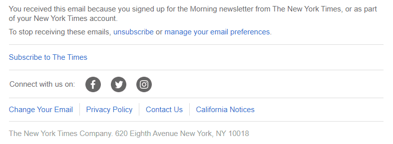
(Source: Email from New York Times)
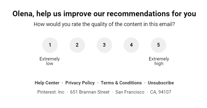
2. Rating to gather feedback from Pinterest
Pinterest placed a simple yet eye-catching rating above the unsubscribe link to collect users’ feedback. Thus, recipients can easily rate the quality of your emails and share their opinion instead of just hitting the “Unsubscribe” button.
(Source: Email from Pinterest)
3. Minimalism from Stripo
When I’m looking for the unsubscribe link in an email, I want it to be noticeable and without unnecessary details. Stripo offers the eye-catching “Unsubscribe” button. Pretty much everything you need for a succinct yet efficient unsubscribe link.

(Source: Email from Stripo)
4. Eye-catching email design from MAC Cosmetics
Sometimes unsubscribe links are hidden at the very bottom of newsletters and are written in a super-tiny font, so you are forced to spend a lot of your time spotting them. Well, MAC Cosmetics made the unsubscribe link noticeable and legible to recipients.

(Source: Email from MAC Cosmetics)
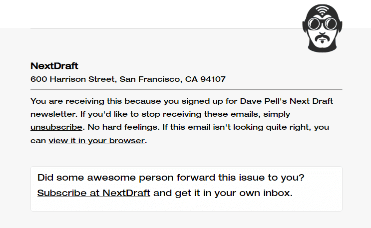
5. Subscribe + unsubscribe links from NextDraft
It’s an unusual yet efficient practice. NextDraft equipped their emails with both subscribe and unsubscribe links. When a user shares an email with a friend and they want to subscribe to the company’s newsletters, there’s no need to open a website and look for a subscribe option.
(Source: Email from NextDraft)
Common mistakes to avoid in your unsubscribe experience
While it may seem easy to add the unsubscribe link to your email’s footer, there are still some common mistakes that can ruin your email marketing campaign. We will provide you with some examples of poor unsubscribe experience. The brand names will be hidden for ethical reasons.
1. Illegible text
You want your subscribers to effortlessly look through your content and find all the necessary email elements, don’t you?
Don’t make recipients squint their eyes trying to detect the unsubscribe link written in a tiny font. And don’t forget about a combination of text and background color. Spoiler alert: grey text over a black background is a bad idea.

2. Inconspicuous links
Make your unsubscribe link noticeable enough to ensure your recipients can find it within seconds. Underline links to draw subscribers’ attention and keep your messages accessible.

3. Clipped emails
When your email is clipped, your recipients can’t see the full message. Instead, they have to follow the “View entire message” link. It happens when your email exceeds a certain size set up by an email client. For instance, in Gmail, this limit is 102 KB.
In the example below, you can see a clipped email. I had to click on the “View entire message” link to open this message in a new tab and find the unsubscribe link. We recommend you keep an eye on the size of your emails to avoid this mistake.

How to add the unsubscribe link to your emails with Stripo
There is no such thing as an "Unsubscribe email template" as ALL of your emails should contain such a link.
-
pull a new structure in your email template;
-
click the "Text" option;

-
enter the text. It can be either "Unsubscribe", "Unsubscribe here", "Stop receiving emails", etc.;
-
double click it;
-
in the "Text editor panel", hit the "Link" button;

- insert the link.
Important to note:
This link is generated by your ESP/CRM. So, you can add this link after pushing your email template from Stripo to your ESP.
Please be advised that you can save this element to your Modules. And when designing a new campaign, you will just have to pull this sample from the Modules tab in your email.
As we've already mentioned, the link should take recipients directly to the unsubscribe confirmation page — no unsubscribe confirmation emails are allowed here.
Below, we want to show you some effective unsubscribe page examples along with tips.
10 tips for effective email unsubscribe pages
To gather the best unsubscribe page examples for the article, I had to unsubscribe from all the newsletters I kept receiving. Must confess that I was too sorry to do that. Once I received the desired unsubscribe page examples, I hurried to subscribe back.
Important to note:
Double opt-out is allowed across the US, Canada, Eastern Europe, and Asia. While in the EU only a single opt-out is allowed.
The latter means that customers unsubscribe with just one click. The double opt-out requires more actions from your customers, which can really irritate them.
We're sharing only those unsubscribe page examples that follow the single opt-out as it is preferred by most customers. This method is adopted by most companies worldwide.
Tip 1. Confirm unsubscription
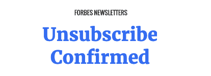
First of all, you need to inform recipients you've heard them and have removed them from your contact list.
(Source: Unsubscribe confirmation page by Forbes)
This is a simple unsubscribe page, with no extra elements in its design. However, it's quite informative and successfully fulfills its mission.
Tip 2. Add the resubscribe button
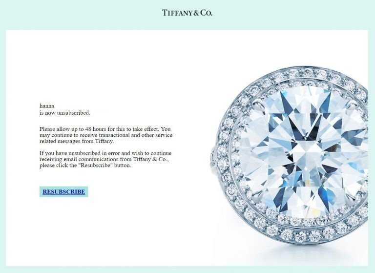
I felt extremely sad when I unsubscribed from Tiffany&Co’s news. Gosh… But they immediately offered me to resubscribe. Thank you, guys! This is a very good idea to let your customers get back to your newsletters. Especially if they clicked the “Unsubscribe” link accidentally.
(Source: Unsubscribe confirmation page by Tiffany&Co.)
Tiffany&Co. notifies the clients it will take up to 48 hours to take effect.
Tip 3. Let subscribers fix their "mistakes"
This email unsubscribe page is pretty much like the previous one. Designmodo added the "Mistake" button at the bottom of the email.
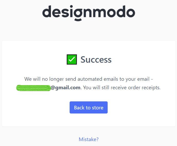
(Source: Unsubscribe confirmation page by Designmodo)
To my big surprise, when I clicked this button, I was told that I would be subscribed back. This made me smile :).
What is also good about this email? They notified me I would still receive some kinds of transactional emails that require some actions from my side.

Tip 4. Ask users to take a very short survey
Once a person's just unsubscribed from you, ask them to take a short survey on the unsubscribe page. It will be critical to know what makes people leave. Of course, if you are going to change the situation for the better.

Ask just 3-4 questions or even use a Google form where the customer chooses just one right answer: “too often”, “not interested”, “high prices”, “poor choice of products”, etc.
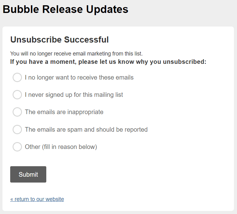
(Source: Unsubscribe confirmation page by Bubble)
Please, remember to thank respondents for their time.
Of course, you should translate this unsubscribe page template with the survey into all the languages you run your email campaigns into.
Tip 5. Say you're sorry
Let your recipients know you're gonna miss them.

(Source: Unsubscribe confirmation page by CNN)
As you can see, the unsubscribe page design is always pretty simple. No distracting elements.
Tip 6. Provide alternative
Always, always provide an alternative. If daily emails are too much for your subscribers, a biweekly newsletter is probably exactly what they want. Give people a choice. Especially, if they would really love to read your emails on weekends. Take a look at the perfect unsubscribe text message example.
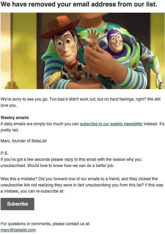
(Source: Unsubscribe confirmation page by Betalist)
Tip 7. Enable recipients to pause their subscription
Once a user has clicked on the unsubscribe link, they will see your unsubscribe confirmation page. On this page, you can offer users:
-
resubscribe;
-
manage email preferences;
-
pause their subscription.
A subscription pause is a great way to enable users to stop receiving emails from your company for a certain period of time (1 week, 30 days, 3 months, etc.) or for a selling season if a subscriber doesn’t want to receive a sequence of promotional holiday emails.
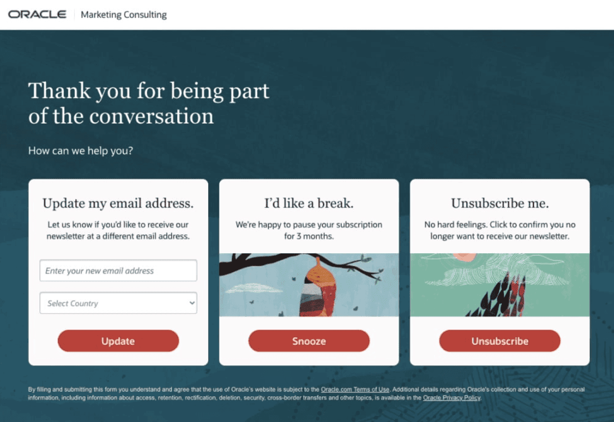
(Source: Oracle)
According to the survey, 63.3% of email marketers enable their subscribers to receive newsletters at different frequencies. It’s an excellent way to keep your recipients engaged and reduce email unsubscribe rates.
Tip 8. Ask users to fill out the form
In tip 4, we suggested that you ask recipients to take a short survey and choose the reason why they decided to unsubscribe. But some users are more likely to leave a comment to tell you why they left if they can’t find their reason on the list.
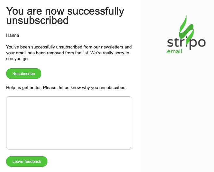
(Source: Unsubscribe confirmation page by Stripo)
Important to note:
In order to stay aware of what your customers think about you, include such forms in your trigger and promotional emails.
In our "Data Service" blog post, we show how to easily embed similar forms in your emails.
Tip 9. Never allow pop-up notifications on your unsubscribe pages
Yes, exactly. A pop-up notification with ads appeared on the unsubscribe page of one of the world-famous brands. It was pretty annoying, given that the notification was pretty big in size, and the brand does not provide a single opt-out. So I had to close this pop-up to enter my email address and confirm unsubscription.
Tip 10. Allow users to unsubscribe from all of your newsletters
Today, many companies run a few campaigns per week. With one email, they share brand news, whilst with the second email, they send their recent blog posts. Or just run different campaigns for various blog sections. For instance, HubSpot lets you choose news according to the topics you are interested in: marketing or sales. Of course, you can choose both. CNN runs different campaigns on over 10 topics.
So, when a user unsubscribed from one topic, they might also want to unsubscribe from other topics that they previously picked.
Hence, it is pretty reasonable and very kind of you to let users unsubscribe from all newsletters at once.
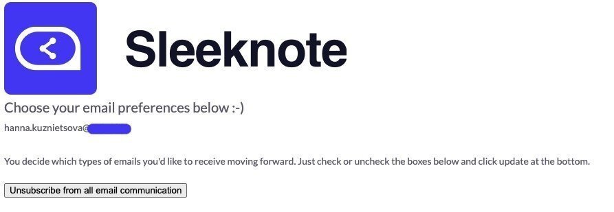
(Source: Unsubscribe confirmation page by Sleeknote)
Recommendations to decrease the unsubscribe rate
According to the KnowledgeBase statistics, 2% of unsubscribers per newsletter are within marketing norms.
However, there's something you may do to decrease this number or at least to keep it within norms.
1. Ask recipients if they like your emails
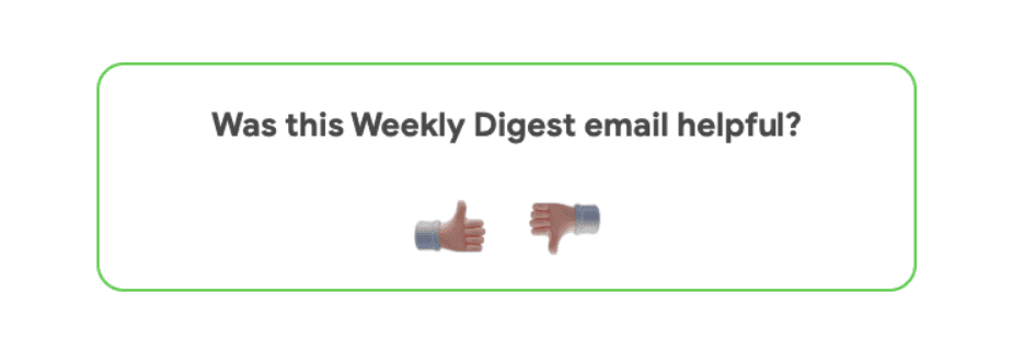
(Source: Email footer sample by Stripo)
How to build a similar footer for your emails in Stripo:
-
drag a two-column structure in your email footer;
-
pull in the "Image" blocks;
-
upload your images;
-
paste respective URLs.
Your ESP will provide you with statistics on each campaign.
When you receive feedback, respond! If you got "5 stars", thank the recipient for it. If the email got "2 stars", send out a short survey where you ask just a few questions. This will help you improve all future campaigns.
2. Offer users to change their preferences
Interests can change over time and that’s completely fine. Give subscribers a choice to set their new preferences at any time. Thus, they are more likely to stay with you instead of just clicking on the unsubscribe link.
3. Engage early with welcome offer pop-ups
One effective way to reduce future unsubscribes is to create a strong first impression. Welcome offer pop-ups — such as limited-time discounts or exclusive resources in exchange for an email — can help you attract high-intent subscribers from the start. These users are more likely to stay engaged, especially if your welcome emails reinforce the offer with value-driven content.
Wrapping up
Here, we surveyed the unsubscribe page best practices. In order to keep customers, you should:
-
Never stop your customers if they want to go. Instead, offer them a choice — add the “Unsubscribe button” and the “Update email preferences” option to all emails you send out.
-
Use any of the aforementioned best practices.
-
Provide recipients with relevant newsletters.
-
Use a single opt-out unsubscription for the EU to comply with the GDPR rules. You can also use it in the US in order not to annoy subscribers and to let them leave with no extra moves.
-
According to the KnowledgeBase statistics, 2% of unsubscribers per newsletter are within marketing norms. If you go beyond this number, then you should reconsider your email marketing strategy. We suggest that you start with A/B testing or survey invitation emails to find out how you can make newsletters more relevant to your subscribers.
-
Add the "Like" and "Dislike" buttons at the end of your emails to know what recipients really think about them.
-
Cherish and celebrate your customers and they will not even think of leaving you.
May your customers never unsubscribe from your newsletters.



4 comments