15 email design best practices

Think of some visually catching marketing campaigns. What is the first thing that comes to mind? Is it design elements or visual content? How about animated GIFs? With so many things to consider and so little consistency in rules, how do you even stay on-brand? What are the key elements you need for your marketing emails?
Well, we’ve got you covered! Together, we will dive into the best practices for email design and discuss tips for email subject lines, call-to-action buttons, mobile responsiveness, web-safe fonts, and techniques for effective email campaigns. Let’s get started, shall we?
1. Write a powerful subject line
As scary as it sounds, you often get only one chance to grab a prospect’s attention. Studies show that 47% of email recipients decide whether to open an email based on the subject line only. Moreover, 69% of receivers move offers straight to the spam folder when the email subject lines appear commercial.
Before you decide to quit email marketing for good, hold up! We have simple yet working best practices for your email subject line:
- subject lines preciseness and length: according to EmailToolTester, the best subject line length varies from 30 to 50 symbols for mobile devices and goes up to 100 for desktops. The exact limit depends on the email client and screen dimensions;
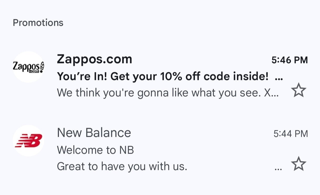
(Source: Email from Zappos)
- dynamic content: a recent report states that 63.7% of specialists use dynamic content to personalize their emails, including the text in the subject lines.

(Source: Email from Ryanair and Grammarly)
2. Create a catchy email preheader
An attention-grabbing preheader is a key part of email design best practices and the final point between an opened and an ignored email. Preheaders are typically a continuation of the email subject lines; thus, another chance to spark your target audience’s curiosity or trigger an emotion. Why?
A recent study concluded that emotional needs formed 86% of purchase-related decisions, so satisfying one in your marketing email can be a win!
Whether you want to bet on the feeling of appreciation or exclusiveness, secure it with the call to action, and you are good to go.
Please note:
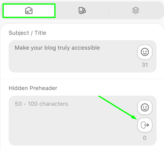
- email recipients get to see from 30 to 80 characters on a mobile device and up to 130 on desktops, depending on the email client (Gmail or Apple Mail or any other), so it is best to keep it short and mobile responsive;
- use the preheader characters to add details to the subject line and support the idea of the email message;

(Source: Email from Tony’s Chocolonely)
- if the preheader does not fit your style, you may use some white space. Otherwise, the email recipients might see the descriptive alt text or an offer to check the web version.
3. Stay on-brand
Consistent brand identity builds trust for your company — it’s as simple as that. According to Emarsys research, since the start of social media in the mid-1990s, true and ethical loyalty to particular brands has increased by 26% and 25%, respectively. What does this mean?
Recently, the importance of a strong connection between the company and its target audience has increased.
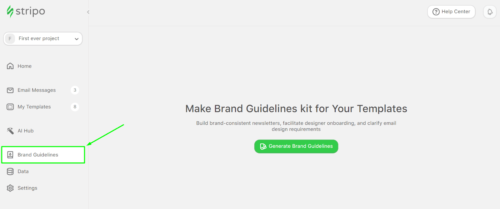
Sticking to the same narratives, color schemes, fonts, and visual content across all channels helps recipients recognize the brand.
The Stripo team has crafted the Brand Guidelines kit with email design styles, logos, and contact details so that your email marketers can stay on-brand.
4. Craft your email header
Now that the subject line and preheader are ready, the email design is next. Your email header pillars are visually appealing, informative, and minimalistic.
What are the key visual elements to include? Let’s figure out the email design best practices together:
- company name and logo are a must to help subscribers differentiate your marketing emails from your competitors;
- the navigation menu is equally important. Best practices suggest adding the main website sections, discounts, and store finders;
- an option to “view in browser” should also be included. Not all email clients render interactive elements or GIFs correctly, so it’s best to be sure!
Though the unsubscribe button is mainly associated with the footer, some prefer adding it to the header, so you may tweak the email as you wish.
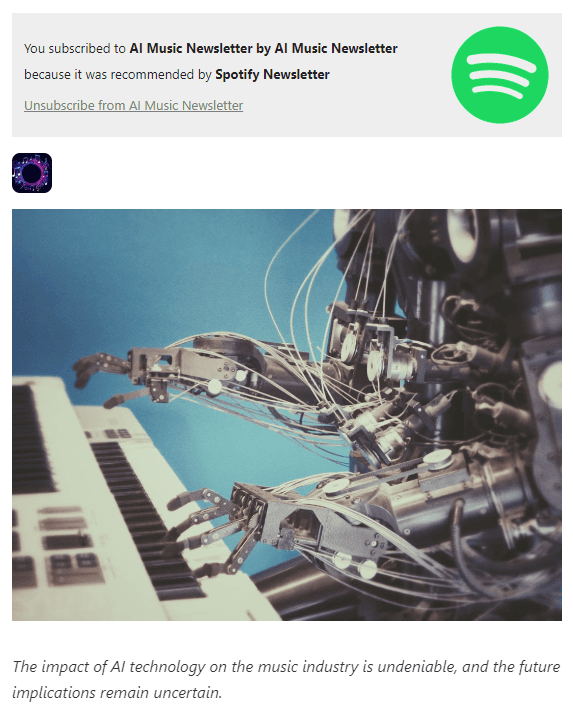
(Source: Email from Spotify)
5. Add email annotations for the Gmail promo tab
All’s fair in love and email marketing strategy, right? Well, Gmail annotations are another tool that comes in handy for your email campaign.
While many email marketers want to get their email campaigns into the Inbox tab, the Promotions tab is not the enemy!
It offers a sneak peek at what is inside. Custom images and promotions appear right before email recipients, so consider these teasers.
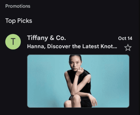
(Source: Email from Tiffany & Co.)
6. Use legible email fonts
You might want to experiment with fonts when creating emails. However, some web fonts (we bet you have tried Google ones!) are tricky, as mailbox providers may not display them properly.
Arial, Tahoma, Verdana, Trebuchet, Georgia, and a well-known Times New Roman are among the top web-safe fonts list.
Here are more email design practices:
- remove italics from your email. It is always hard to say goodbye to the old fonts, but italics are a “no” when it comes to accessibility;
- limit the use of different fonts to 3. “The more the merrier” does not apply to fonts in email design.
7. Make meaningful email banners
Think of the banners as a sweet addition to your email, and try not to overwhelm it.
A good banner strategy involves engaging with the target audience through on-brand images, links, or GIFs that convey the idea of the email message.
The key here is to tell a story rather than just sell. Overly promotional banners may look suspicious, so it is best to stick to storytelling instead.

(Source: Stripo email template)
Tips for banners to consider:
- while most go for images with a standard size of 600–700 px on desktops, you can try other dimensions. Just keep mobile responsiveness in mind;
- try using carousels, videos, and GIFs;
- add transparent custom images or collages to refresh your email template.
8. Add appropriate GIFs
How about spicing up your marketing emails with animated GIFs instead of static text or old-fashioned email design?
Best practices suggest experimenting with content to find your style. It is as relevant as ever, but bravery comes with complications.
For example, load times often negatively impact engagement. A workaround? Optimize GIFs, especially for mobile users.
Rules to follow when adding animated GIFs to emails:
- add no more than one GIF on the screen. Otherwise, the email may trigger photosensitive seizures;
- limit your GIFs to two flashes per second;
- use alt text to make your GIFs accessible for screen readers in case they don’t load or display properly;
- put the most informative image in the first frame. Some mailbox providers may not render GIFs right, so email subscribers only get to see the first frame.
9. Make call-to-action buttons noticeable
Call-to-action buttons (CTA) never go out of style and are one of the key email design best practices that still drive conversions. These motivate the audience to check out your website or learn more about your services. How do you make the buttons stand out in your email campaigns? Let’s have a look:
- use contrasting colors to separate CTA buttons from the rest of the written and visual content;
- attach links to forward recipients to particular web pages;
- adjust the size to ensure the button is clickable on desktop and mobile devices.
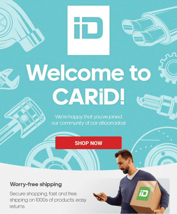
(Source: Email from CARiD)
10. Stick to mobile-friendly email design
Let’s start with some statistics. According to Hubspot, 46% of emails are opened on phones. Do your email marketing campaigns have a responsive design? If not yet, here are some tips when working on a mobile version of the email:
- use a one-column layout for optimization. Multi-column-layouts are not the best choice for mobile devices;
- add larger fonts. The text should be readable and noticeable without zooming in;
- remove some of the design elements to free up space and avoid clutter;
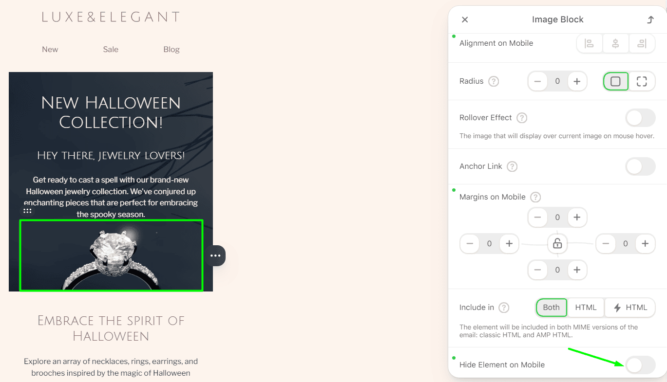
(Source: Stripo email template)
- extend the call-to-action button to the entire mobile screen length, making it easier to tap on.
Now, let’s compare the email design for desktops:
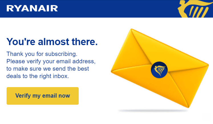
(Source: Email from Ryanair)
Here is the same email template on the mobile device:
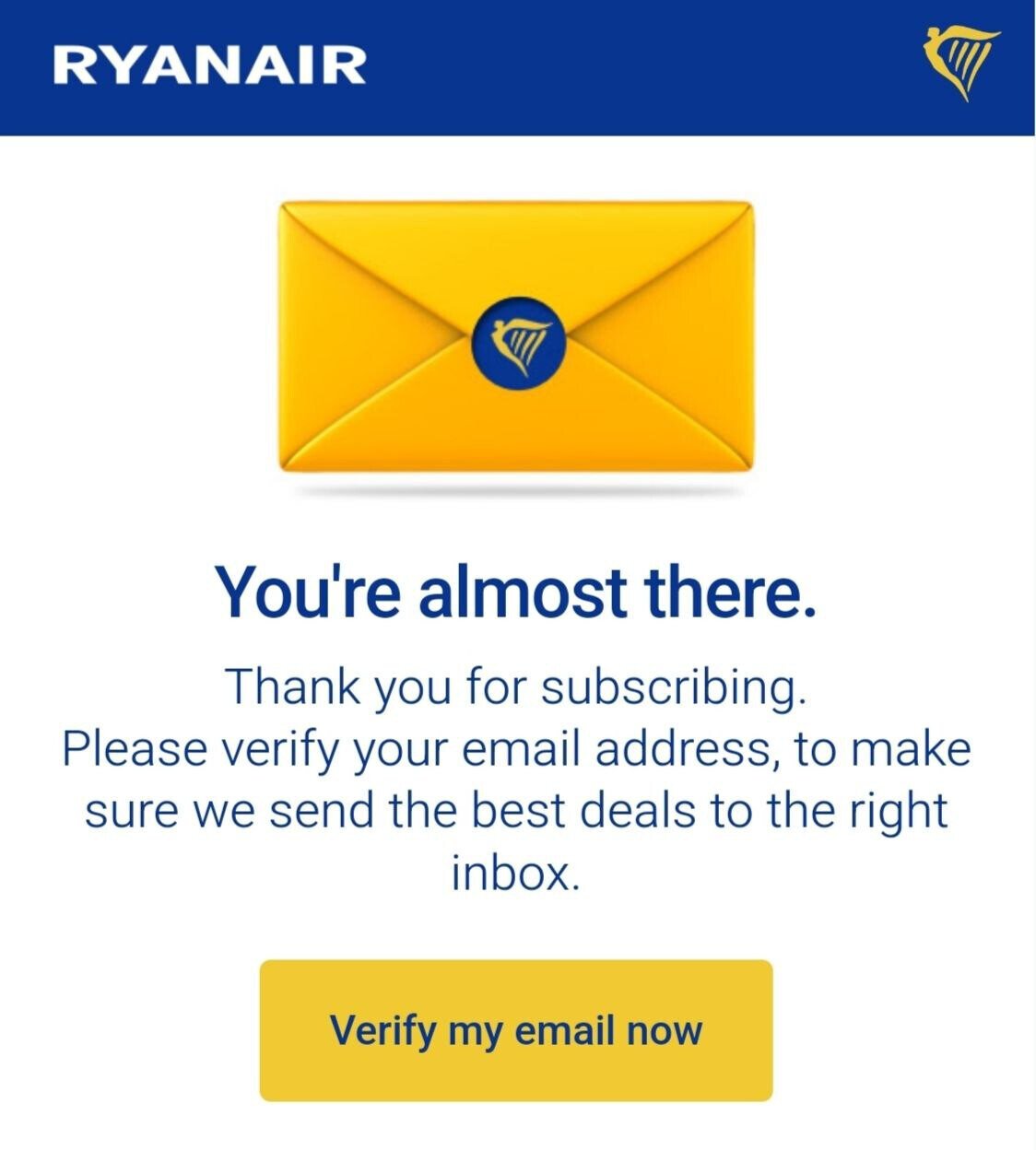
(Source: Email from Ryanair)
11. Be concise
The modern audience prefers brief, minimalistic, and straightforward email designs. While there is no defined email length for everyone, try to get to the point within 10 seconds.
Would you like to promote your recent blog post? Great! Make sure to add a call to action, images, a link to the web page, and a text block with details on what is inside.
Do you have any discounts? Add numbers and conditions, and secure them with a call-to-action button. Avoid lengthy introductions, and put important things first.
12. Don’t be afraid to use interactivity in emails
Interactive elements may separate good email marketing from great email marketing. You can embed polls, surveys, or quizzes into the email templates to engage with the target audience even more.
(Source: Email from Stripo)
A/B testing on the embedded interactive form by Stripo received 5.2 times more feedback than the external one.
People are more likely to respond right in the email template, so why waste the chance?
13. Utilize gamification in emails
Games are no longer just an activity; they have become powerful email marketing tools. But when in doubt, check the statistics:
- gamification increases conversion rates by 27% for the electronic sector;
- the click-through rate reached 11.1% compared to 1.1% for non-gamified emails.
(Source: Email from Stripo)
14. Consider email accessibility
Accessible email design ensures that your offer reaches the entire audience, including those with disabilities.
Adding alt text to images, animated GIFs, and utilizing screen-reader-friendly layouts are crucial for 2024 email marketing.
You can check out some of the best practices to make your email design accessible in our email accessibility guidelines. Here’s a little spoiler: All emails you create with Stripo are fully optimized.
15. Add a footer
The footer is the endpoint of your email, but it is still an excellent opportunity to engage with the audience and keep your email on-brand.
Add social media icons, links, contact details, and, most importantly, an unsubscribe link.
To comply with the CAN-SPAM Act and GDPR, ensure to include the following in your footer:
- an unsubscribe button;
- a reason why the email recipient received your marketing email;
- a physical address.
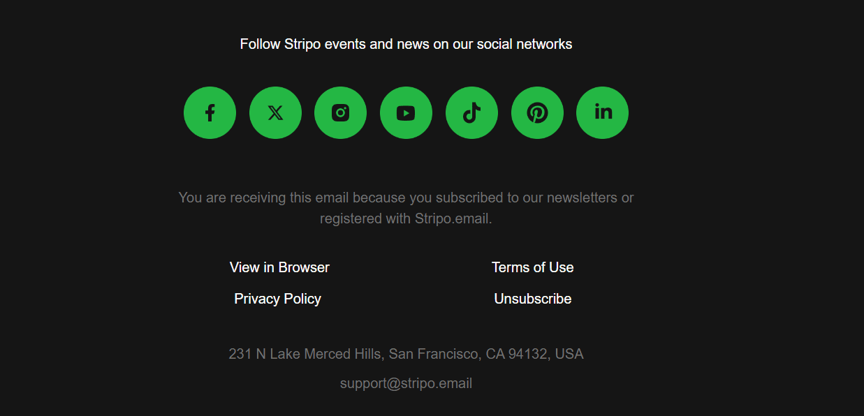
(Source: Email from Stripo)
Wrapping up
Email marketing is a place to free up your imagination and experiment. While some standards exist, crafting unique, mobile-responsive, and accessible email marketing campaigns creates more value.
We gathered best practices and statistics so that you could find your favorites and confidently create your own email templates with Stripo!





0 comments